Project Overview
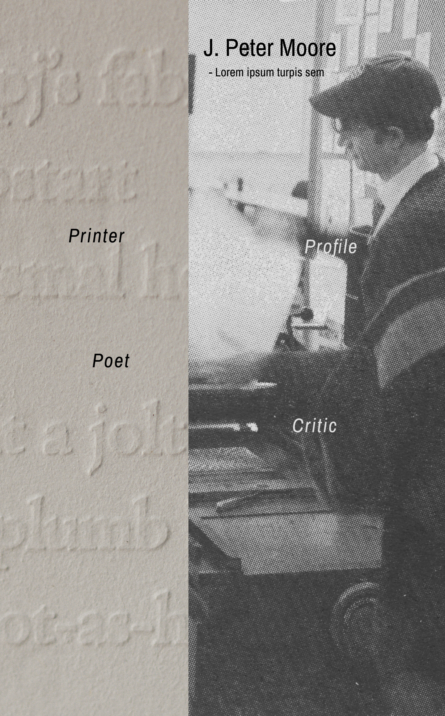
Dr. J. Peter Moore needed a personal portfolio website to showcase his work as an educator, letterpress artist, and small-press publisher. The challenge was translating deeply tactile, print-based work, letterpress projects, publications, and seminar courses—into a digital experience that felt refined, personal, and true to his typographic sensibility.
This project evolved through multiple rejected layouts and ultimately shifted from traditional design tools into a coding-first design approach to better capture nuance, typography, and process.
The Challenge
Designing for a client with decades of experience in typography and print meant every decision would be scrutinized through an expert lens. The site needed to feel like an extension of his craft and not a generic portfolio template.
- Designing for a client with decades of experience in typography and print
- Translating physical letterpress qualities into a digital format
- Avoiding rigid, templated portfolio structures
- Capturing an artistic vision that was difficult to express in static mockups
- Balancing simplicity with personality and authorship
Early Design Exploration
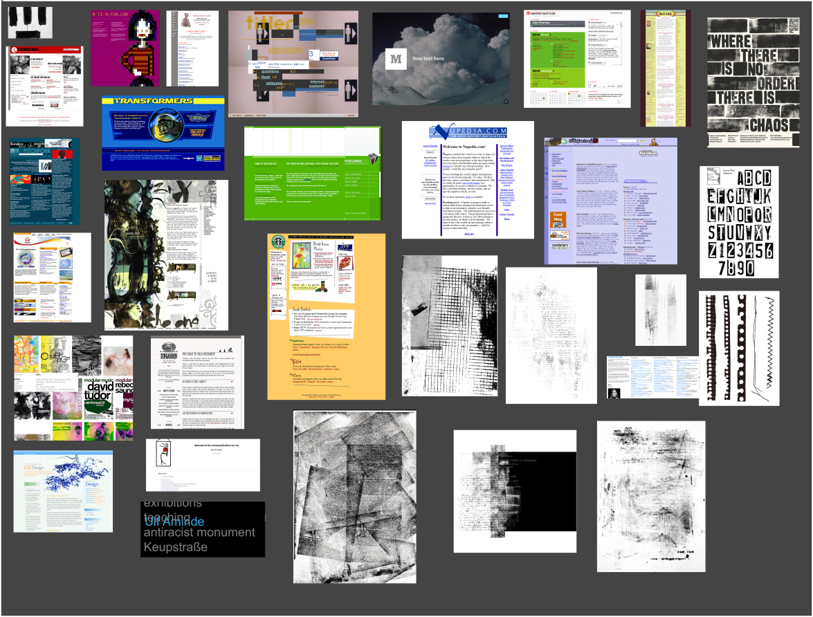
Quick Inspiration Board (3 Reference Sites)
I began by studying three portfolio websites referenced by the client. These sites shared minimal layouts, strong typographic presence, and a sense of authorship rather than polish.
- Minimal navigation
- Typography-led layouts
- Content-first hierarchy
- Informal, personal tone
Version 1 & 2 - Rejected Layouts
The first two design directions followed clearer structure and conventional portfolio patterns. While functional, both were rejected by the client.
Client Feedback: Too structured and institutional. Felt "designed," not personal. Unlike the portfolios of his peers. These rejections revealed a misalignment between usability-first layouts and expressive intent.
Pivot: Rethinking the Approach
Vision Board
To reset direction, I created a vision board focused on mood over layout, drawing from the client's preferred imagery and typographic references.
- Typography as the primary design language
- Generous whitespace inspired by book margins
- Simplicity and restraint
- Visibility of process rather than polish
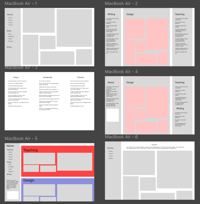
Wireframe Reset
Using the vision board, I created a stripped-down wireframe focused on flow, rhythm, and content hierarchy rather than components. This direction was approved immediately and became the foundation for the final build.
Color Palette
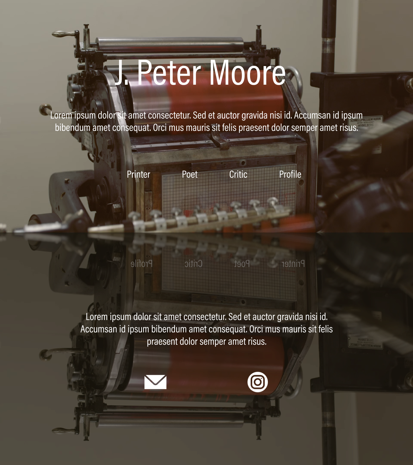
The palette is rooted in a dark, immersive foundation of a near-black background that lets the bold typography and content images command attention. A warm cream serves as the primary text and heading color, evoking the ink-on-paper quality of letterpress work in a digital context.
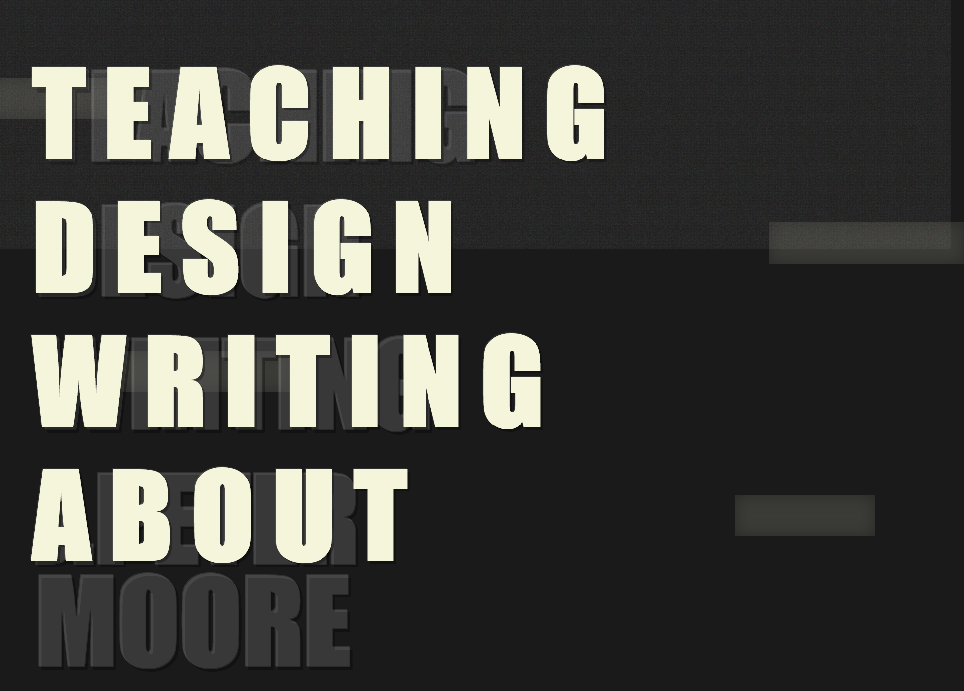
Typography
The site's typographic identity is deliberately bold and unapologetic. Considering that Impact is a a condensed, high-contrast display face, it was chosen for its raw visual presence. Set at oversized scales with wide letter-spacing and dimensional text-shadows, it gives each page the commanding feel of a poster or broadside print.
Navigation Pattern
A persistent left sidebar anchors the site's navigation, which is a deliberate nod to the table of contents in printed books. The active state uses a vertical bar indicator with a subtle background shift, while section headings in the content area repeat the oversized Impact treatment to orient the user within each category.
Layout Properties
The site is built on a set of foundational CSS properties that define its immersive, centered, full-viewport presentation. These decisions reinforce the idea of each page as a self-contained environment like a stage for the content, not a scrollable feed.
Design Insight
While refining the approved wireframe, it became clear that Figma could not accurately represent the typographic nuance, spacing, and browser behavior the project required.
Key realization: The experience the client wanted was easier to build than to mock up.
Solution: Coding as Design
I transitioned directly into live coding, using HTML, CSS, and JavaScript as the primary design tools. Designing in the browser allowed real-time experimentation with typography, spacing, and layout behavior using actual fonts and rendering.
Why Code First
- Accurate font rendering and spacing - Web fonts behave differently than Figma previews
- Precise typographic control - CSS gave full command over letter-spacing, line-height, and OpenType features
- Faster iteration and feedback - Changes were live instantly, no mockup-to-code translation
- Immediate responsive testing - Mobile behavior tested continuously, not as an afterthought
- Higher fidelity client reviews - Dr. Moore reviewed the actual site, not an approximation
Final Outcome
The final site is minimal, typographic, and expressive. Rather than relying on visual decoration, it communicates identity through type, rhythm, and restraint—making the creative process visible in the finished product. The result aligns closely with the portfolios of the client's peers while remaining uniquely personal.
Results
- Fully custom, live-deployed portfolio
- Strong alignment with client's artistic vision
- High performance and accessibility
- Flexible structure for future updates
- Positive client feedback on typographic fidelity
What I Learned
- Rejected designs often clarify the real problem - The two failed layouts narrowed the path to the right solution
- Code can be a design medium, not just implementation - Designing in the browser produced higher fidelity than any mockup
- Simplicity requires deliberate, confident decisions - Restraint is harder than complexity
- Adapting process to the project leads to stronger outcomes - No single workflow fits every client
- Typography-driven design demands tools that respect nuance - Figma's rendering couldn't match what the browser delivered